Colour blocking interior design is a deliberate strategy that uses large, solid swathes of contrasting or complementary colours to create visual structure and focus. Unlike an accent wall, ombré or patterned wallpaper, colour blocking relies on geometric simplicity and scale to redefine how a room reads.
Rooted in modernist and Bauhaus principles and popularised by late 20th-century fashion, the approach moved into interiors through designers and brands. You will see it in Farrow & Ball’s bold palettes, Dulux’s trend forecasts and features in House & Garden and Grand Designs.
In practical terms, transformational colour schemes can zone open-plan living, make low ceilings feel higher and enlarge compact rooms. Bold colour interiors also establish mood, provide striking backdrops for furniture and art, and refresh period properties without structural change.
This piece is for UK homeowners, renters and interior designers who want stylish, lasting ways to update homes while respecting British details such as sash windows, bay windows and period cornices. Read on to learn how colour block decorating UK can be applied with confidence and creativity.
How does colour blocking transform interior spaces?
Colour blocking reshapes a room with clear planes of colour. This short section explains what the technique is, how colour alters mood and space, and gives practical examples tailored to UK homes.
Defining colour blocking for interiors
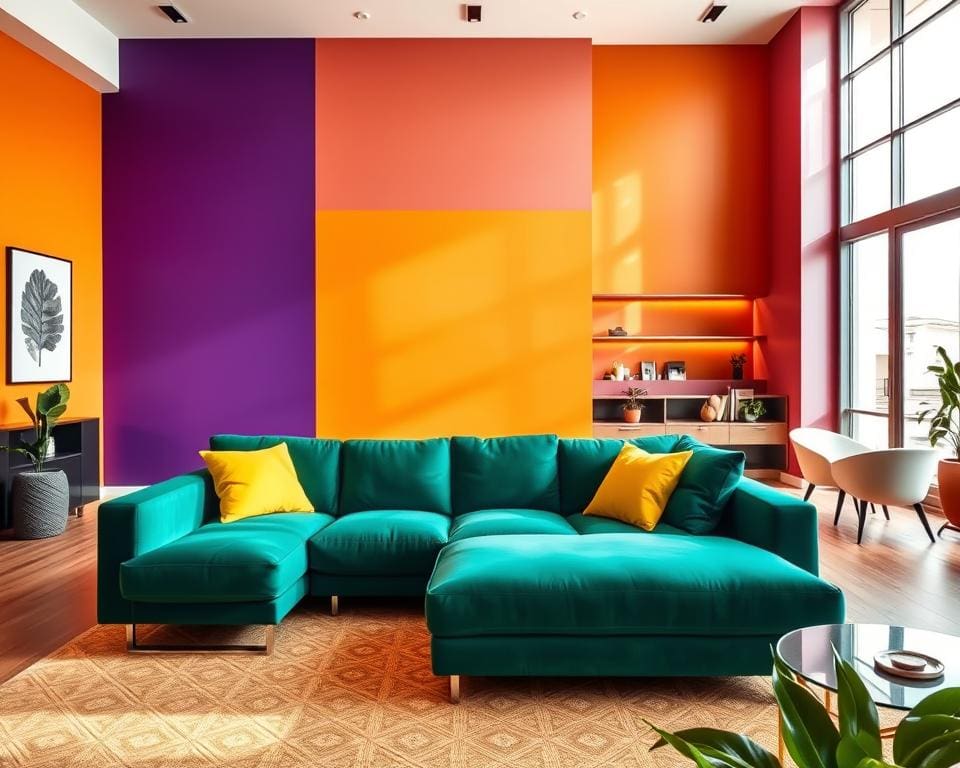
Defining colour blocking means using two or more solid, contrasting or harmonious colours in clearly delineated areas to form bold graphic compositions. The approach favours large fields and geometric boundaries such as bands, rectangles and straight lines rather than small accents or repeat patterns.
Materials and finishes play a key role. Paint, lacquered cabinetry, coloured tiles, rugs and large textiles all work well. Reputable UK paint brands like Farrow & Ball, Dulux and Little Greene offer reliable pigmentation. Consider sheen—eggshell, matt or satin—to control reflection and perceived depth.
Colour blocking differs from an accent wall and colour washing. An accent wall highlights a single area. Colour washing creates soft gradients. Choose colour blocking when you want high-impact scale and a clear, repeatable visual grammar across surfaces.
Psychological and spatial effects
Basic colour theory explains how warm hues such as reds and ochres advance and create intimacy. Cool hues such as blues and greens recede and make spaces feel larger. Saturation and lightness change mood and perceived scale.
Bold, high-contrast blocks energise social areas like kitchens and dining rooms. Softer, low-contrast blocks promote calm in bedrooms and studies. Horizontal bands can lengthen a room. Vertical blocks give the impression of higher ceilings.
Contrasting lower-wall or floor blocks anchor furniture and can widen narrow rooms. Natural light direction alters colour reading. Test colours at different times of day and under typical artificial lighting to see real effects.
Deliberate blocks create visual order. This reduces perceived clutter and supports room zoning with colour in open-plan living. Clear divisions help the eye and the mind understand function without physical partitions.
Practical examples in UK homes
Small London flat: use a deep, cool lower wall block with a pale upper block to make low ceilings feel taller. Pair with slimline modular sofas and mirrors to reflect light.
Georgian terrace dining room: apply a saturated block behind panelling or within recessed bays to highlight cornices and bays while keeping ceilings neutral to preserve period elegance.
Contemporary new-build: use coloured cabinetry to delineate cooking from lounging. For example, a Farrow & Ball Hague Blue kitchen island against pale walls creates clear room zoning with colour and a modern focal point.
Rental-friendly options include peel-and-stick panels and self-adhesive tiles from UK suppliers such as Wallsauce for temporary colour-block effects without damage. British design titles like House & Garden and Elle Decoration UK often showcase schemes that demonstrate these tactics.
Practical techniques and design strategies for successful colour blocking
Good colour blocking begins with clear rules and careful testing. Start by choosing a restrained base and build bold elements around it. This section outlines straightforward methods for colour palette selection, contrast decisions and practical placement for colour blocking that work in British homes.
Begin with a neutral that runs through large surfaces such as ceilings and skirtings. Use one or two dominant shades for the main blocks and an accent for small features. Try British brands like Farrow & Ball or Dulux for coherent palettes and test pots in the room to see how light shifts colour.
Decide your contrast levels in interiors by the mood you want. High-contrast pairs, for example navy and mustard, give drama. Low-contrast mixes produce calm and refinement. Apply the 60-30-10 rule: 60% dominant, 30% secondary, 10% accent for balanced results.
Placement strategies for walls, ceilings and floors
Use placement for colour blocking to zone a space. Mark kitchen islands, hall runs or reading nooks with floor-to-ceiling blocks or dado-height bands. Align block edges with architectural features for a tidy look.
Consider ceilings as active surfaces. A lighter painted ceiling lifts a room. A darker shade creates a cocooning feel. For floors, large rugs, painted boards or coloured tiles anchor furniture groups. Look to UK suppliers such as Neptune, The Rug Seller and Fired Earth for durable options.
Prepare surfaces carefully. Prime, undercoat and use good painter’s tape for crisp lines. Caulk timber joinery and use level guides when masking to keep edges clean.
Integrating furniture, textiles and art
When walls are saturated, choose furniture in neutrals or single tones to avoid visual overload. Use cushions or stools that pick out a block colour to create rhythm. This furniture and textile integration makes the scheme feel intentional.
Soften geometric blocks with texture: wool throws, velvet cushions and woven baskets add warmth. Hang large-scale artworks to echo block hues or to provide contrast. Buy practical pieces from retailers such as John Lewis, Heal’s, Habitat and Made.com to match scale and finish.
Balancing boldness with longevity
Opt for timeless pairings that age well, such as navy with ochre or muted teal with soft grey. These long-lasting colour schemes UK buyers and renters tend to prefer.
Keep bold choices flexible. Start with removable elements—rugs, curtains, slipcovers—or try paint on a single wall or cabinetry before committing to full-room treatments. For high-traffic zones, select washable matt or satin paints and stain-resistant upholstery fabrics.
If you live in a listed building or rent, use reversible methods such as paintable removable panels or peel-and-stick finishes and check conservation rules or tenancy terms before making permanent changes.
Inspiration, trends and practical considerations for homeowners in the United Kingdom
British interior trends show a clear appetite for brave colour. Post-pandemic interiors now favour personality, mixing heritage paint houses such as Farrow & Ball and Little Greene with contemporary pops showcased in Ideal Home and Livingetc. Popular palettes pair botanical greens, muted terracottas and deep blues with heritage neutrals; spring leans lighter, while autumn and winter move to richer, jewel-toned blocks. For quick colour-blocking inspiration, follow features in Grand Designs and Dezeen or browse curated boards on Instagram and Pinterest.
Adapt colour blocking to your house type. Victorian terraces often suit subtle lower-wall blocks that respect cornices and panelling, while Edwardian and Georgian properties benefit from restrained, period-aware contrasts. Contemporary flats and lofts can carry full-height or dramatic ceiling blocks. When considering conservation areas and colour, always check local council guidance and seek advice from a conservation officer or accredited historic interiors specialist for listed interiors.
Practical matters such as light, budget and family life shape good outcomes. North-facing rooms take warmer blocks to counter cool daylight; south-facing rooms can handle darker tones. For renters, rental colour-block tips include peel-and-stick panels, removable wallpaper and sample paint swatches on MDF boards. Choose low-VOC, washable paints and use high-durability finishes at lower-wall heights to withstand family wear.
Begin with a short plan: choose a mood and palette, test samples, map surfaces and edges, then prepare properly or hire a decorator. Source trusted suppliers like Dulux, Farrow & Ball and Little Greene for paint, B&Q or Wickes for materials, and Wallsauce for removable murals. Read House & Garden or Elle Decoration UK and watch Grand Designs for practical case studies. Be adventurous but methodical—use test patches, respect architectural detail and layer texture so colour blocking schemes feel curated, comfortable and enduring in UK homes.