You need to understand colour trends to make confident choices for your home. Contemporary interiors change as culture, the economy and new materials evolve. Knowing the latest interior colour trends UK helps you pick schemes that feel current and suited to British light and room sizes.
Experts such as Pantone, Dulux, Farrow & Ball and Benjamin Moore shape modern colour palettes through annual forecasts and curated launches. Their reports, together with coverage in Elle Decoration UK and House & Garden, steer retail ranges at B&Q and Wickes and influence trending interior colours across the market.
This article will explain why colour matters, explore key palettes—earthy neutrals, jewel tones, muted greens, soft pastels and bold contrasts—and offer practical tips for applying trends in your own space. The guidance is aimed at UK readers, whether you are a renter, a DIY decorator or hiring a professional.
The following sections draw on paint manufacturers’ seasonal forecasts, industry journalism and retail insight so you get practical, market‑relevant advice for selecting modern colour palettes that work in real homes.
Understanding modern palettes and why colour matters in interiors
Choosing a palette shapes how a room feels and functions. You will notice that modern palettes bring cohesion, mood and a clear design direction to a home. This short guide explains how colour works, where to find palette inspiration and practical ways to test your choices before you commit.
How colour affects mood and perception of space
Colour psychology interiors is a tool designers use to shape emotion. Warm tones like reds, oranges and warm beiges energise a space and create cosy corners. Cool blues and greens calm the senses and make areas feel restorative.
Light and colour change how you perceive size. Pale, low-chroma colours reflect daylight and make small rooms feel larger. Deep, saturated shades make generous rooms feel intimate. In the UK, where grey-weather light is common, warmer undertones can counteract a cool natural light and add warmth to a scheme.
Finish and texture alter the effect of a shade. Matt paints hide imperfections and give a soft, contemporary look. Eggshell and satin finishes add gentle reflectivity. High gloss highlights architectural details and stands up well to heavy use.
Biophilic trends favour greens and natural tones to support wellbeing. Introducing botanical hues and natural materials can reduce stress and make a room feel airier and more connected to nature.
Sources of inspiration for contemporary palettes
Trendsetters shape what you will see on shop shelves and editorial spreads. Pantone’s Colour of the Year and seasonal ranges from Dulux and Farrow & Ball steer many retailer lines and inspire new combinations.
Nature remains a rich source of palette inspiration. Muted foliage greens, earthy soils and mineral jewel tones translate into calm, tactile schemes. You can borrow tones from landscapes, seasons or a single plant to build a layered look.
Materials and architecture inform colour choices. Terra-cotta, weathered metals, natural timber and concrete suggest tonal pairings that work with contemporary finishes. Travel, art, film and social platforms such as Instagram and Pinterest speed fresh ideas into popular use.
Practical tips for testing and committing to a palette
When you wonder how to choose paint colours, start by testing properly. Use tester pots on large patches of wall and view them at different times of day under natural and artificial light. Small swatches rarely reveal true effect.
Create a mood board that combines paint chips with fabric swatches, flooring samples and furniture. Seeing materials together prevents clashes and helps you refine undertones.
Begin with small changes. Introduce trends via cushions, rugs or a feature wall before repainting a whole room. Consider undertones carefully: two neutral beiges can conflict if one has a pink base and the other is yellow.
Think of longevity and resale when choosing bold hues. Keep major investment pieces in timeless neutrals and use current colours on accessories that are easy to replace. If you are unsure, consult in-store experts such as Farrow & Ball advisors or Dulux Colour Experts for professional guidance.
Always test paint samples in situ, on different walls and at varied times, so your final choice looks as you expect in your own home.
colour trends shaping contemporary interiors
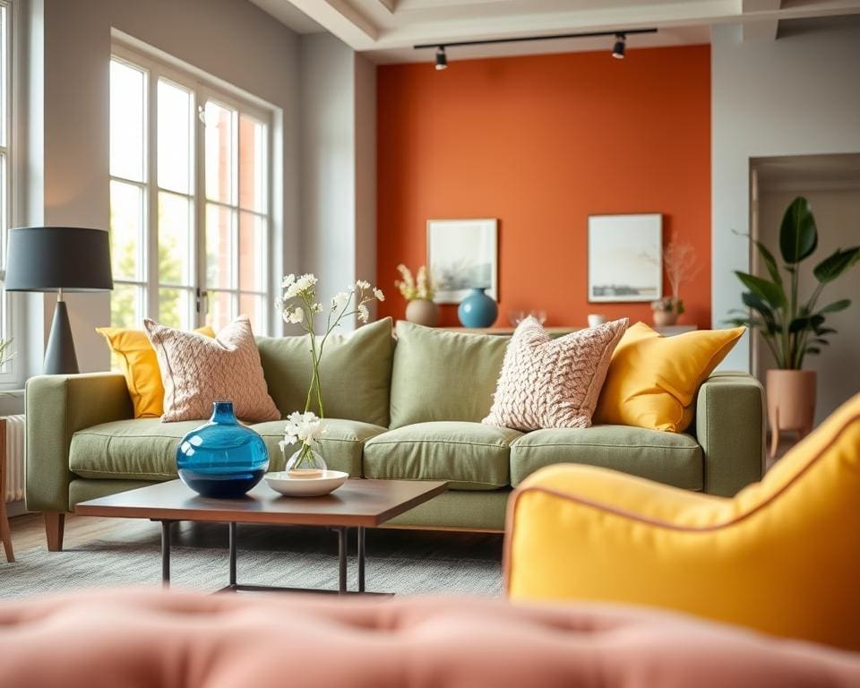
Trends in contemporary interiors are shifting towards palettes that feel lived-in and considered. You will find a move from stark, clinical tones to colours that bring warmth, depth and a link to nature. The choices below explain how to use these looks in your home and which materials pair best with each approach.
Earthy neutrals and warm beiges
Designers such as Farrow & Ball and Dulux have foregrounded warmer beiges and sandy taupes this season. You can use these tones as a soft backdrop in open-plan living areas and bedrooms to create a cosy, timeless feel.
Pair warm beiges with oak or walnut, rattan furniture, linen fabrics and terracotta accessories. Warm metallics like brass or aged bronze lift the palette without overwhelming it.
Rich jewel tones for statement spaces
Deep emerald, sapphire and amethyst make excellent choices for feature walls, velvet upholstery and cabinetry. These jewel tones interiors add drama and a luxurious mood to dining rooms, libraries and bedrooms.
Balance saturated hues with moody neutrals and tactile fabrics. You can combine jewel colours with brass or black metal accents and limit bold colour-blocking in small rooms to avoid feeling cramped.
Muted greens and botanical-inspired hues
Soft sage, desaturated olive and khaki-greens respond to the growing interest in plant-led styling. muted greens work well on painted cabinets, tile choices and matt finishes to bring a calm, restorative atmosphere.
Combine botanical colour trends with natural stone, timber and ceramics. Choose soft brass for warmth or black tapware for contrast depending on the tone you want to set.
Soft pastels and modern dusted colours
Modern pastels have been greyed down to feel contemporary; think dusted rose, powder blue and muted lemon. These colours suit nurseries, bathrooms and Scandinavian-inspired rooms where you want a gentle uplift.
Layer pastels with warm neutrals or crisp white trims to keep the scheme fresh without feeling saccharine. Wallpaper collections and paint ranges from trusted British brands highlight how versatile these shades can be.
Contrasting black, charcoal and bold accents
Black interiors and charcoal accents are used as bold, defining elements rather than full-room choices. You can apply them to window frames, kitchen joinery, doors and radiators for sculptural impact.
To avoid creating a heavy room, combine black or charcoal with plenty of daylight and warm materials. Introduce bright punches of colour such as mustard, terracotta or teal to enliven the scheme and draw the eye.
How to apply current colour trends in your home
Start with a simple assessment of each room. Note whether a room is north-facing or south-facing, the type of flooring and window frames, and how much natural light it receives. North-facing rooms usually benefit from warmer tones to counter cool daylight, while south-facing rooms can carry cooler greens and blues without feeling dim.
Create a cohesive palette using the 60-30-10 rule: choose a principal colour for 60% of the room, a secondary colour for 30% and one or two accent colours for the remaining 10%. This helps you apply colour trends at home in a balanced way and makes decisions about paint ideas UK and feature wall ideas much easier.
Plan practical projects by room. In the living room, use warm neutrals as a base and add a jewel-toned sofa or armchair for impact, with charcoal or black trims to create contemporary contrast. For kitchens, consider mossy greens or dusted blues for cabinetry, pair them with natural stone worktops and brass hardware, or paint the island a contrasting jewel tone as a focal point. Bedrooms work well with soft pastels or muted greens; introduce depth with a saturated headboard fabric or a painted alcove. In bathrooms, use botanical greens or gentle pastels on walls and tiles and pick matte black or brass fittings for a modern finish.
Use small-scale interventions to test trends affordably. Swap cushions, curtains, throws and rugs to reflect seasonal changes. Painting kitchen units, shelving or interior doors is a cost-effective route to refresh interiors, while patterned wallpaper or bold tiles in hallways and powder rooms let you try feature wall ideas without a full overhaul. For larger jobs, hire decorators or joiners and communicate your palette with sample boards and annotated photos. Choose durable finishes—satin or eggshell in high-traffic zones and washable paints for family homes—and keep leftover tins labelled for touch-ups.
When budgeting, mix high-street options with specialist suppliers. Affordable paint ranges and ready-made soft furnishings from IKEA, Made.com and John Lewis let you apply colour trends at home without overspending. For curated palettes and premium finishes, consult Farrow & Ball, Little Greene or Fired Earth. Before you commit, test samples on-site at different times of day, ensure harmony with permanent elements like flooring and kitchen units, and favour reversible changes if you might sell. These decorating tips will help you use colour trends now while protecting long-term value.